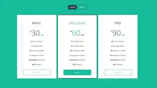
Price comparison tables are one of the important tools in modern website design. If you want to improve your sales this tool will definitely help you a lot. Consumers are the primary audience for businesses, but they should know what their options are and what could be the cost. In this blog, we will share a code snippet about a price plan design or pricing table design. This responsive pricing table example showcases how pricing tables can be a responsive element and are really easy to make with the help of HTML, CSS, and JavaScript. This pricing table is created by Shane Heyns. We have several code snippets on our website. Click the load more button underneath the homepage to get those snippets.
If you own a business for an organization or a product organization, you should include pricing tables or subscription plans designed on your site. The green background of the snippets is the first thing that catches our attention. The price range and the offers are allocated from low to high. The data are neatly organized into padded spaces so that they don't overlap with each other. You can click the button at the bottom to sign up for the particular offer. We can see a toggle icon at the top of the snippet. Monthly and yearly subscriptions are available here. As you choose the other option, the tables flip to the next side which also shows the available offers. The Flipping effect is really awesome to watch. This snippet is responsive as well. The price plan will show vertically instead of horizontally in the small devices.


Post a Comment
Please do not enter any spam link in the comment box.