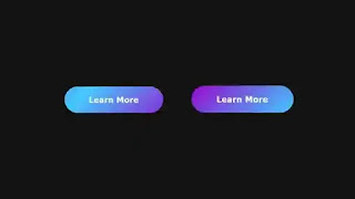
Buttons are an essential part of any website. Because it indicates to users that an action can be performed by clicking or tapping the button. Buttons on a website can be of different shapes, sizes, and styles. Buttons are given different colors, gradients, shadows, and animations to make them visually appealing. In our today's blog, we will show how to create an animated gradient button on hover. You can watch the video demo below to see how the button hover animation will look. Our website has many projects like CSS animation, landing page design, etc. To visit them, click on the Load More button below our website homepage.
Video Demo:
Hope you have seen the video demo. Adding animation to website buttons is a good idea to add interactivity and engagement. An animated button always looks more attractive to a visitor than a static type button and it helps to increase user interaction. An animated gradient button on hover could be a nice example of that. With this in mind, we added a four-color gradient animation to our button. As we all know, CSS gradient is a powerful feature of CSS that helps us to make a smooth transition between two or more colors. This interesting feature is used to add depth, dimension, and visual interest to any element of a website or app.
You May Also Like:
Animated Gradient Button on Hover [ Source Code ]:
To create this Animated Gradient Button on Hover you will need to create an HTML and a CSS file. After that copy and paste the following codes into your project. In case of any malfunction, you can download the same code from the download button below.
ADD HTML:
ADD CSS:


Post a Comment
Please do not enter any spam link in the comment box.